Analysis of log frequency-varying charts
Introduction
Log frequency, which uses the Rescharts interface, measures the contrast of narrow bar or sine charts that increase logarithmically in spatial frequency. It also measures color Moiré (Imatest Master only). When the image pattern is sinusoidal (rather than a bar chart), contrast is equivalent to SFR or MTF. This method is more direct than the slanted-edge method, but less accurate and more susceptible to noise. A chart can be created by Test Charts and printed on a high quality inkjet printer.
![]()
Log Frequency image (complete and cropped)
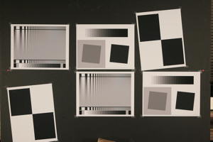
The image above used to illustrate the Log frequency module and to compare results with Slanted-edge SFR. It was captured with a Canon EOS-20D camera, 24-70mm f/2.8L lens set at 42mm, f/5.6, ISO 100. It includes Log Frequency-Contrast charts and slanted-edges with high and low contrast (20:1 and 2:1). Log frequency was run using a narrow strip of the Log f-contrast chart, as shown above.
Creating and photographing the chart and running the program
Create the test chart, which may not be commercially available, using Imatest Test Charts, then print the chart on a high quality inkjet printer. Test Charts has a number of options. The dialog box and recommended settings are shown in Log F-Contrast. In Imatest Studio, Type (bar or sine) should be set to Bar, sine (4x).
Mount the chart on a flat dark board— 1/2 inch foam board works well; thinner board warps more easily. Depending on the number of horizontal pixels in the chart to be analyzed, the chart should occupy 1/3 to 1/4 of the horizontal frame. Other charts can be mounted along with it.
Orientation. The pattern may be rotated by multiples of 90 degrees from the orientation shown: it may be have portrait as well as landscape orientation.
Photograph the chart using the sort of lighting described in Imatest Lab or How to test lenses, taking care to avoid glare. Save the image in any one of several high quality formats, but beware of JPEGs with high compression (low quality), which will show degraded quality, unless, of course, you are testing JPEG degradations. (Unlike the slanted-edge, the Log f-contrast pattern reveals JPEG losses quite clearly).
Open Imatest, then click on . The Rescharts window is described in the Rescharts page.
Select a pattern to analyze (in this case, Log frequency (simple) ) by clicking on one of the entries in the popup menu below Chart type or by clicking on if Log frequency (simple) is displayed. The button and popup menu (shown on the right) are highlighted (yellow background) when Rescharts starts.
Select the image to read. If the pixel size is the same as the previous Log frequency run, you’ll be asked if you want to use the previous ROI, adjust the previous ROI, or crop anew. If the folder contains meaningless camera-generated file names such as IMG_3734.jpg, IMG_3735.jpg, etc., you can change them to meaningful names that include focal length, aperture, etc., with the Rename Files utility, which takes advantage of EXIF data stored in each file.
Cropping The pattern should be cropped to a narrow strip, as shown in the ROI fine adjustment window, below. 10 to 25 pixels is a typical strip width, though more pixels may work if the chart is well-aligned. The ROI fine adjustment window may be maximized to facilitate fine selection.

ROI fine adjustment window showing the Log Frequency-Contrast image
cropped for use with Log frequency (simple). Canon EOS-20D camera,
24-70mm f/2.8L lens set at 42mm, f/5.6, ISO 100. Click on image to load full-size image.
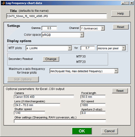
If Express mode is not selected, the input dialog box shown on the right appears. Since this dialog box is used for several modules, some entries such as SQF options are not relevant.
Settings
Gamma is used to linearize the test chart. It can be measured by Stepchart, Colorcheck, or Multicharts. 0.5 is a typical value for color spaces intended for display at gamma = 2 2 (sRGB, Adobe RGB, etc.).
Channel is R, G, B, or Y (luminance; the default).
Color space is used only for the color moiré L*a*b* chroma plot (sqrt(a*2 + b*2)).
Display options
MTF plots selects the x-axis scaling. If Cycles/inch or Cycles/mm are selected, the pixel spacing (um/pixel, pixels/inch, or pixels/mm) should be entered.
Secondary readout allows up to two secondary redouts (MTFnn, MTFnnP, or MTF at a specified spatial frequency) to be displayed on the MTF plots. Details here.
X-axis scaling for linear plots selects the maximum spatial frequency to be displayed.
Don’t worry about getting all settings correct: You can always open this dialog box by clicking on in the Rescharts window.
After you press , calculations are performed and the most recently-selected display appears.
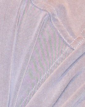
Color moiré on fabric
(Canon Rebel XT with kit lens)
Color moiré
Color moiré is artificial color banding that can appear in images with repetitive patterns of high spatial frequencies, like fabrics or picket fences. The example on the right is a detail of a shirt captured by the Canon Rebel XT with its excellent kit lens.
Color moiré is the result of aliasing in image sensors that employ Bayer color filter arrays, as explained below. Key points:
- Color moiré can appear when there is significant image energy above the sensor Nyquist frequency for the red and green channels (0.25 cycles/pixel; half the image Nyquist frequency of 0.5 cycles/pixel).
- It is affected by lens sharpness, the anti-aliasing (lowpass) filter (which softens the image), and demosaicing software. It tends to be worst with the sharpest lenses.
- It is most noticeable in the red and blue channels.
- Color moiré should be measured near the center of the image, where lenses tend to be sharpest and lateral chromatic aberration (which can mimic color moiré) is minimal.
|
Since there is no well-established standard for measuring color moiré (to the best of our knowledge), we have added a highly versatile measurement to Log Frequency in Imatest Master. One of the parameters shown on the right, selected by the Moire box in the Plot settings area of the Rescharts window, is plotted immediately below MTF in the MTF & Moire displays. The two parameters shown in boldface, R-B and L*a*b* chroma (sqrt(a*2+b*2 )) have proven to be the most useful. A color moiré plot is shown below. The Correct for color density checkbox, which corrects for tonal imbalances in the image, should normally be checked. The lowest frequency where moiré can be visible with Bayer sensors is 0.25 cycles/pixel, half the image Nyquist frequency. This is so because the sensor pixel spacing for the red and blue channels is twice that of the (final demosaiced) image pixel spacing. The total moiré for a selected parameter is the variation of that parameter above 0.3 cycles/pixel, shown in bold red in the plot. For the plot below, it is the maximum − minimum L*a*b* chroma (√(a*2+b*2 )) above 0.3 c/p = 14.9 (L*a*b* units). |
|
||||||||||||||||||||
Log Frequency pattern with exaggerated chroma

![]()
Color moire results expressed as L*a*b* chroma
Output
The Display box in the Rescharts window, shown below, allows you to select any of several displays. Display options are set in boxes that appear below Display. All displays except Exif data have a channel selection option (Red, Green, Blue, or Luminance (Y) (0.3R + 0.59G + 0.11B).
| Display | Description |
| Pattern (original and linearized) | Show pattern: normalized pixel levels (max contrast) on top; linearized (max contrast and selected row) on bottom |
| MTF & Moire (Linear frequency scale) | Display MTF for several contrast levels (rows 1-22 in steps of 3, where the chart is divided into 25 rows for analysis) with a linear frequency scale. |
| MTF & Moire (log frequency scale) | Display MTF for several contrast levels (rows 1-22 in steps of 3) with a log frequency scale. A thumbnail of the pattern is also displayed on the same scale. |
| EXIF data | Show EXIF data if available. |
|
|
| Saves an image of the Starchart window as a PNG file. If you check Display screen in the Save screen dialog box, the image will be opened in the editor/viewer of your choice. (Irfanview works well, and it’s free.) | |
| Saves detailed results in a CSV file that can be opened by Excel and also in an XML file. | |
The spatial frequency is automatically calculated from the image, under the assumption that log frequency increases linearly with distance.
Pattern (original and linearized)

Pattern: original and linearized
The entire Rescharts window is shown. The upper plot is the normalized pixel level (pixel level/255 for bit depth of 8). The lower plot is the linearized levels.
MTF
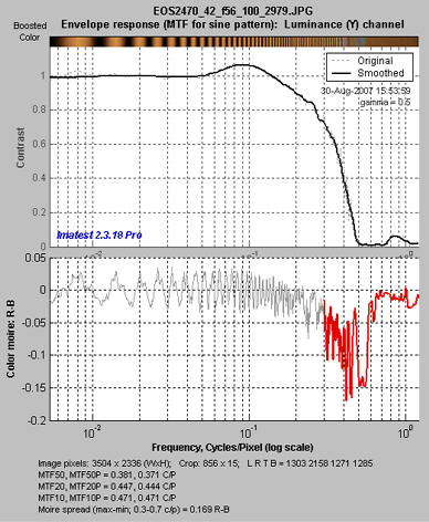
MTF: Log frequency scale
The display on the right shows MTF on a logarithmic frequency scale. A vertically squeezed version of the image with exaggerated color (chroma) is shown just above the plot.
The dark line had been strongly smoothed. The pale dashed lines are the unsmoothed results: the fine detail is a calculation artifact caused by phase variations and noise; it is not significant.
The lower plot shows color moiré (in Imatest Master only) , which is discussed above. The selected moiré measurement is the Red-Blue channel (R-B). Options that affect this plot include Moire (the moiré measurement) and Correct for color density (which is normally checked).
The printed results beneath the plot shows
- the image dimensions and crop locations,
- MTFnn and MTFnnP (the spatial frequencies where response falls to nn% of the low frequency and peak values, respectively) for nn = 50, 20, and 10%, and
- The total moiré spread, which is the maximum – minimum value of the selected moiré measurement (in this case, R-B).
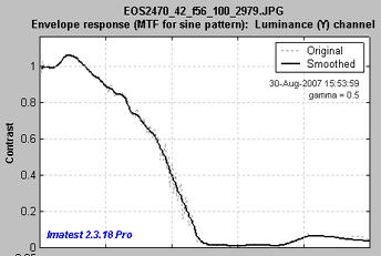
MTF: Linear frequency scale
The display on the right shows the same MTF results plotted on a linear frequency scale with a maximum spatial frequency of 1 cycle/pixel. (Color moiré has been omitted.)
The maximum display frequency, the display scale (cycles/pixel, cycles/mm, cycles/in, or LW/PH (Line Widths per Picture Height, where 2 Line Widths = 1 cycle or line pair)), and gamma can be set to any of several options by pressing the button.
Comparison with other measurementsAn obvious question is, how do Log Frequency results compare with Slanted-edge SFR (identical to the standard SFR module)? The comparison is easy to make because the test target contains low and high contrast slanted-edge charts as well as Log Frequency-Contrast charts. Some divergence is expected because of nonlinear signal processing, which is widespread in digital cameras: most digital cameras, especially compacts, process the signal differently in the presence or absence of contrasty edges. In the presence of a contrasty edge the image is sharpened: high spatial frequencies are boosted. In the absence of a contrasty edge noise reduction is applied, i.e., the image is blurred; high spatial frequencies are attenuated. Since the Log Frequency pattern doesn’t resemble an edge it’s difficult to predict exactly how the different methods will compare. But we have a clue from Log F-Contrast. The MTFnn values for the EOS-20D at ISO 100 (shown on the right) change relatively little with chart contrast, in strong distinction to the compact Panasonic TZ1, especially at ISO 800, which shows considerable nonlinear processing. The low contrast (2:1) slanted-edge MTF is shown on the right. Although its shape is slightly different from the Log Frequency results (see MTF with linear frequency scale, above), MTFnn results are remarkably close: MTF50 is 0.347 vs. 0.381 c/p; MTF20 is 0.425 vs. is 0.444 c/p. The high contrast edge, below right, has similar MTF50 but much higher MTF20. There are several reasons why the different charts may give different results. In all cases the slanted-edge measurement are more accurate, though of course it represents MTF at edges and not in the presence of gradually-varying features.
Despite these factors, a reasonable match between the different methods can be obtained if nonlinear signal processing is not strong.
|
 MTFnn from Log F-Contrast: MTFnn from Log F-Contrast:shows little change with chart contrast |
 MTF from low-contrast (2:1) slanted edge |
|
 MTF from high-contrast (20:1) slanted edge |
Some calculation details
Second-order interpolation, illustrated below, is used in detecting peaks at spatial frequencies between 0.06 and 0.5 cycles/pixel It increases the peak amplitude for detected peaks between sampling points.. At lower frequencies it does little to improve accuracy because the signal varies slowly. It also has no benefit above the Nyquist frequency (0,5 cycles/pixel), where the signal consists of noise and aliasing. The red dots in the illustration show the peak amplitudes corrected with second order interpolation (with uncorrected peak locations).

The peak and its two adjacent points are assumed to fit the equation, y = ax2 + bx + c. The actual peak location is xp = –b/2a (x2 is shown in the above plot). The peak amplitude is ap = b2/2a + c.
Smoothing The MTF & Moiré displays contain two curves: unsmoothed (thin dashed lines) and smoothed (thick solid lines). The smoothed curves are emphasized because the roughness in the unsmoothed curves is entirely an artifact of the calculations, resulting from sampling phase and noise— irregularities can result from noise on a single peak. Irregularities are reduced, but not eliminated, by second-order interpolation. It is important to realize that the features of the unsmoothed curve have no physical meaning.
Frequency display Let x1 and x2 be the left and right x-axis limits and let f1 and f2 be the minimum and maximum display frequencies. Then,
Display frequency = \(f = f_1 10^{k(x-x_1) / (x_2-x_1)}\) where \(k = log_{10}(f_2/f_1)\)
The Nyquist sampling theorem, aliasing, and color moiré
|
(This section was adapted from normankoren.com.) The Nyquist sampling theorem states that if a signal is sampled at a rate dscan and is strictly band-limited at a cutoff frequency fC no higher than dscan/2, the original analog signal can be exactly reconstructed. The frequency fN = dscan/2 is called the Nyquist frequency. By definition fN is always 0.5 cycles/pixel. The first sensor null (the frequency where a complete cycle of the signal covers one sample, hence must be zero regardless of phase) is twice the Nyquist frequency. The sensor’s average sensitivity (the average of all sampling phases) at the Nyquist frequency can be quite large. Signal energy above fN is aliased— it appears as artificially low frequency signals in repetitive patterns, typically visible as moiré patterns. In non-repetitive patterns aliasing appears as jagged diagonal lines— “the jaggies” (a less severe form of image degradation). The figure below illustrates how response above the Nyquist frequency leads to aliasing.
In this simplified example, sensor pixels are shown as alternating pink and cyan zones in the middle row. By definition the Nyquist frequency is 1 cycle in 2 pixels = 0.5 cycles/pixel. The signal (top row; 3 cycles in 4 pixels) is 3/2 the Nyquist frequency, but the sensor response (bottom row) is half the Nyquist frequency (1 cycle in 4 pixels)— the wrong frequency. It is aliased.
Many digital camera sensors have anti-aliasing or lowpass filters to reduce response above Nyquist. Anti-aliasing filters blur the image slightly, i.e., they reduce resolution. Sharp cutoff filters don’t exist in optics as they do in electronics, so some residual aliasing remains, especially with very sharp lenses. The design of anti-aliasing filters involves a tradeoff between sharpness and aliasing (with cost thrown in).
The Foveon sensor used in Sigma DSLRs is sensitive to all three colors at each pixel site. It also has no anti-aliasing filter and high MTF at Nyquist, but aliasing is far less visible because it is monochrome, not color. |


 Bayer CFA